The History of the Graybar Logo
Graybar’s brand reflects where we’ve been and what we’ve become.
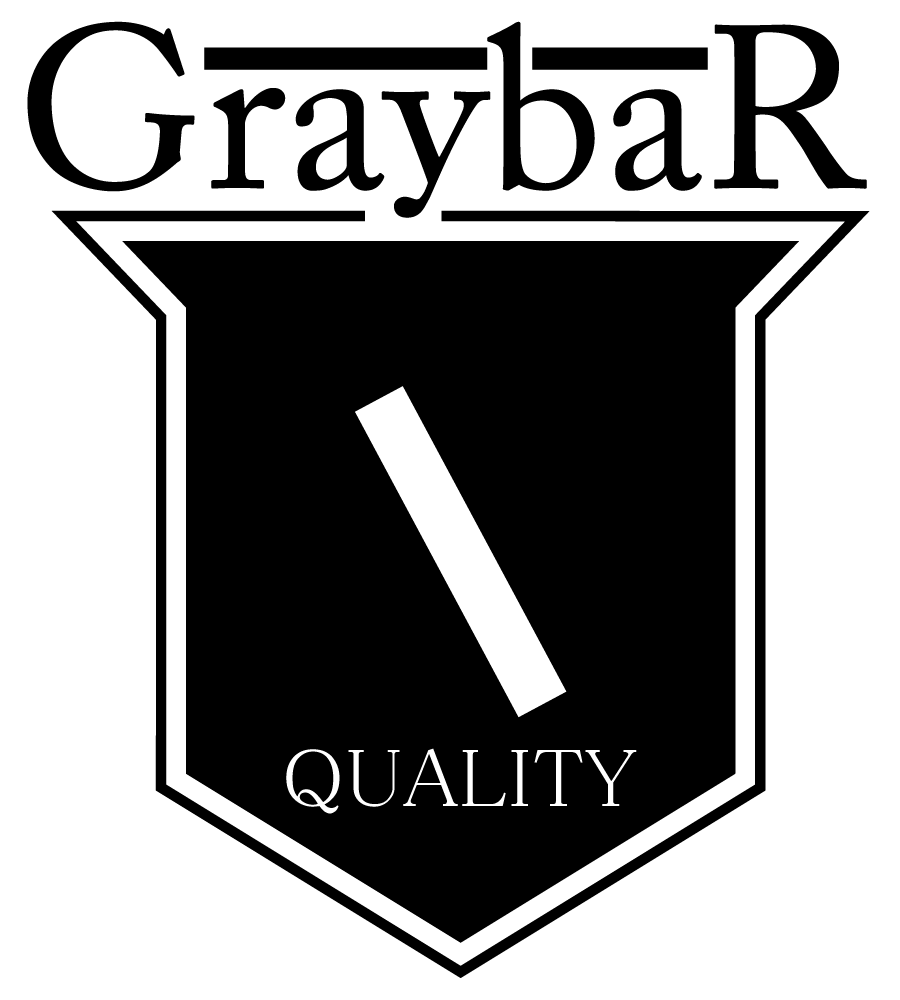
1920s
A shield, much like those that knights wore on their crests, is introduced as the new company logo.
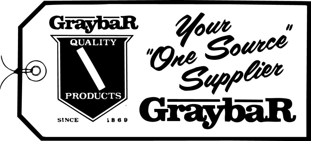
1940s
The Graybar tagline changes and evolves in order to communicate to a widening set of audiences as the company experiences tremendous growth.

1950s
The Graybar logo is slightly revamped, using a thicker, more updated font that reflects changing times and business focus.
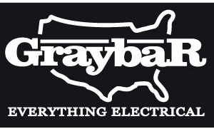
1960s
Graybar celebrates the “beginning of its second century” and unveils a new logo with the continental United States behind the Graybar name.
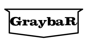
1970s
A new logo with the Graybar name in a stretched shield, reminiscent of the original Graybar shield, is introduced. The new trademark symbolizes a return to Graybar’s roots.
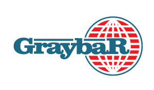
1980s
To better signify its growing dominance as an international distributor, Graybar adds the image of a globe behind its name.
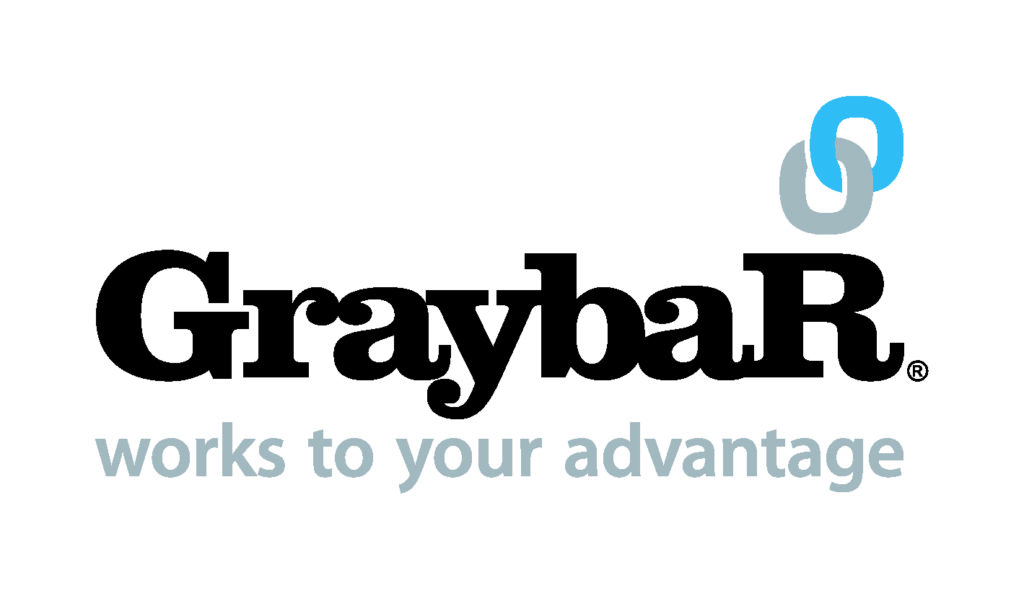
2000s
Graybar’s current brand identity presents a modern image while drawing on the brand’s history and significance, firmly positioning the company as a vital link in the supply chain.
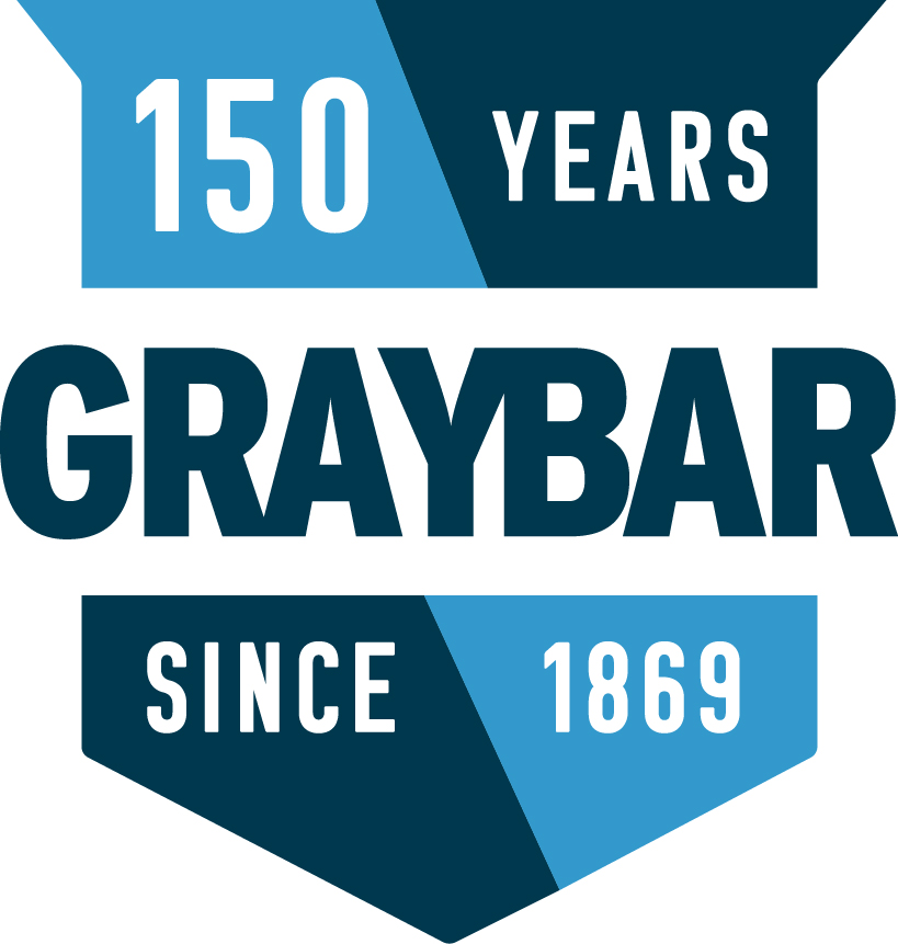
2019
To celebrate Graybar’s 150th anniversary, a new logo was unveiled. The special anniversary logo features the Graybar shield to honor the company’s heritage while pointing to its vision for the new era.
